MacOS 26

Since WWDC25, Apple introduced a new design called Liquid Glass. This will be present on all Apple devices - iOS, macOS, iPadOS, watchOS, tvOS, and will be the foundation for the next 5-10 years of Apple software iterations.
I've been running it on my Mac since the 10th - it works and looks pretty good, especially for a first version. I love the new Safari look, I like that everything aligns between OSs, from icons to general UI/UX. I like that we get a phone app on Mac, and yes even the control centre is pretty awesome.
I think people need to actually try it - the screenshots don't do it justice. Yes, there are some issues here and there, but this is a developer beta 3-4 months before the actual update so there will be plenty issues fixed (and probably more will appear that will need fixing) - but for now the experience is solid.
Let's look at what has changed:
- Icons revamped: this is not such a huge change really. They are squircles. They can be tinted or they can be left to default. They can be turned into Dark/Light themed versions as well.

All icons have been remade and they do look familiar, yet renewed. I personally don't like the clear look but the dark additions are welcome.

- Round edges: this is a bit annoying and I can see how it may be improved slightly over future iterations:
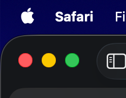
- Tabs: the new tabs look great to me! Very similar to the original, but nicely done with the new aesthetic.


What I don't like is the slight edge/outer layer of each window, but an unexpected result is that resizing windows seems to be a bit better - not had that problem before, and as a Rectangle user, I won't really benefit much from this feature.
- Widgets: I like to control my Home accessories from the three-finger swipe widget/notification area. This hasn't changed much to be honest - maybe it seems a little bit improved graphically, but without one to one comparison, I would not be able to tell the difference.
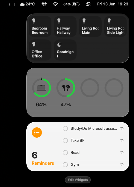
I do wish we'd give a bit more of an effort to fit text nicely in one line, in some widgets... We have the technology.
Also this screenshot is taken with dark mode on, yet the Reminders widget and the battery widget are both light mode... Just beta things.
- Control Center: this is a big one.
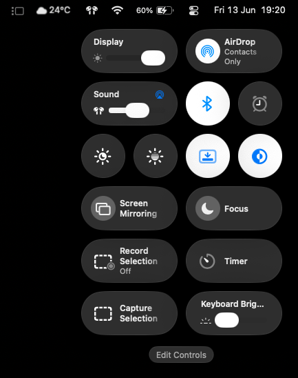
Holding Command shows this:
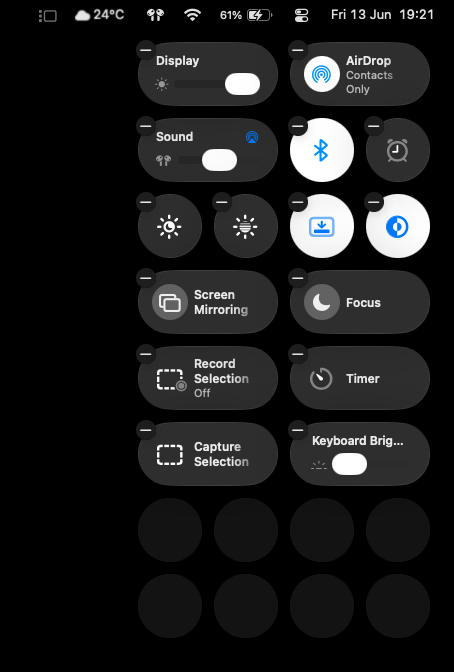
Which enables you to conveniently move controls as preferred. You'd need to press on the Edit Controls button to add more stuff.
You can pin some more items to the menu bar now - a lot of them (Home app opens the app, rather than a drop down to control your accessories, for example) don't work as you'd expect them - but some do. For example, you can pin Stage Manager to the menu bar. I'm sure in time we'll get some quality of life updates that would help with that.
I am a fan of the new Display/Sound bars. It will probably look better once this goes GA.
- The new Sound and Brightness volumes are awesome. I love this. It's an upgrade from the good ole' icon in the middle of the screen, in my opinion.
- There are a lot of tiny things - people deride Apple's attention to detail but I can see plenty things sprinkled across the OS which were not on Sonoma, and it does give it an overall "upgraded" vibe. The animations are sleek. They are scattered everywhere through apps and actions, from the menu bar to sending a message. Stage manager seems to be "quicker". Apple Intelligence/Siri has a better GUI and response window (it's unfortunately still not very capable).
- The entire OS has a degree of translucency - the WWDC presentation shows moving a piece of glass over the underlying objects - and this is pretty much how it all feels, but on your screen. I'm not sure if this is good or bad yet - many people seem to hate it. I felt disappointment during the WWDC presentation feeling like the change was not exactly massive. I somewhat agreed with the comments saying "They've just set the opacity to 0" - but there is a bit more going on here. Everything is familiar, yet a bit different - which I think was the point of this. I can see myself using both Dark and Light mode so I hope this adapts without getting messy visual bugs - so far, there are a few.
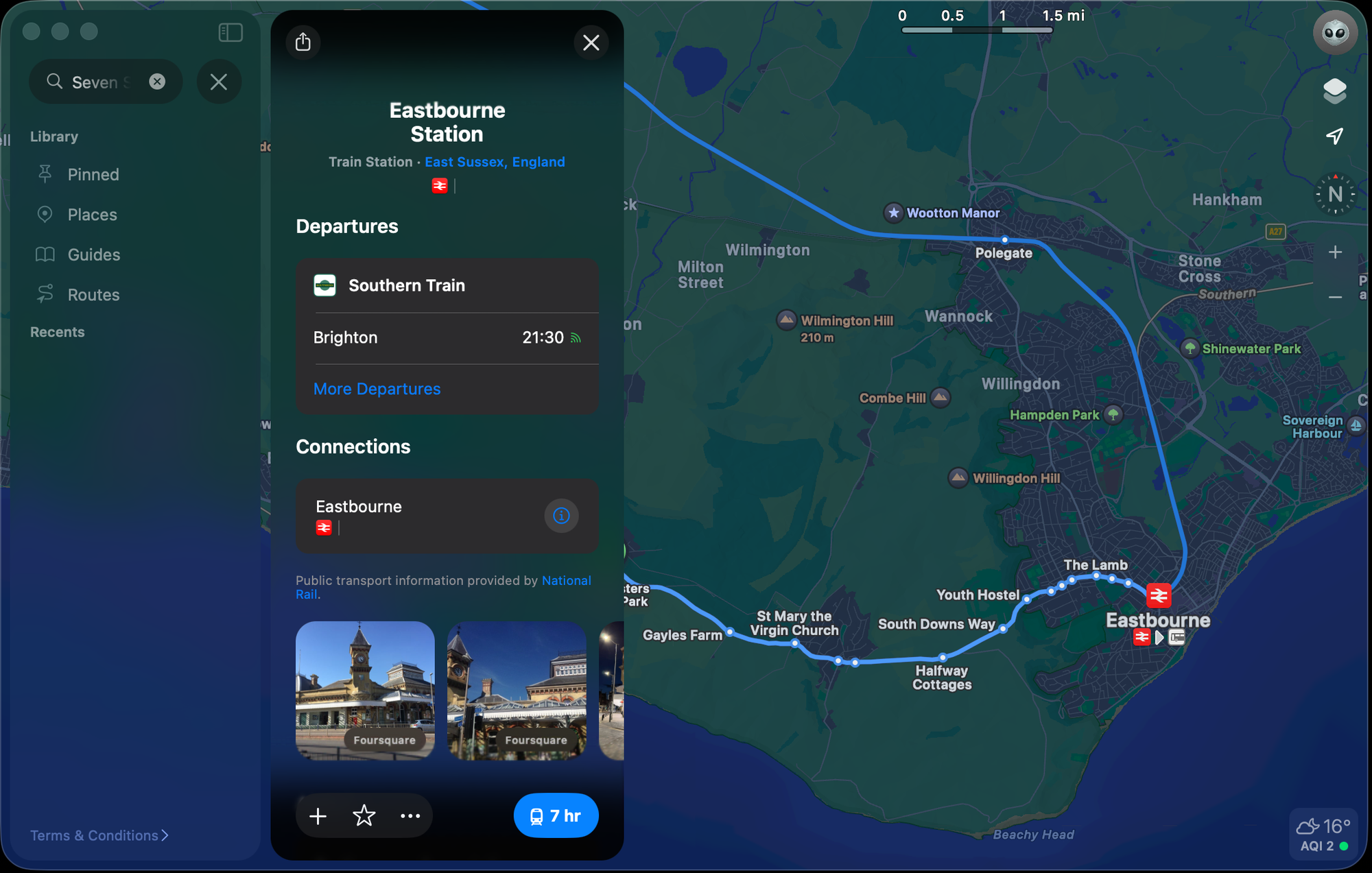
- Maps got a pretty good facelift.
- Spotlight:
It is now Launchpad, a clipboard, universal search, able to take in-app actions from simple language, and has the ability to customise key shortcuts for said app actions. This is a huge upgrade for a feature that was already working well.
- Notes: supports Markdown, and can export to it as well, but crashes constantly and needs some work.
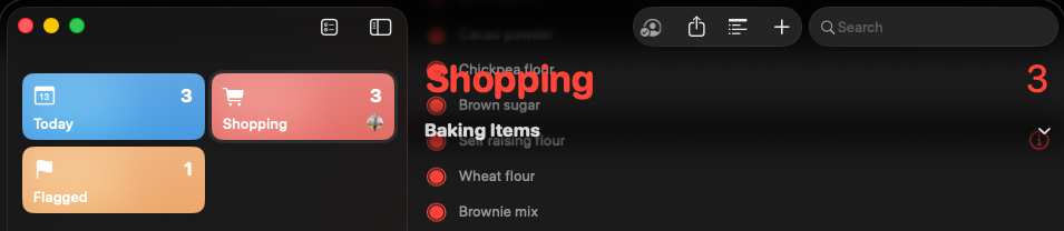
- Reminders: not looking great unfortunately. This is pretty bad for readability, not sure what they're doing here.
- Mail: I like the new Summarise button - I think the icons need a bit of work. As a person who keeps a clean inbox and archives email, and prefers using the app half screen (psycho, right?), I dislike that we can't have an Archive button one click away.


There are some readability issues, and it's the first time I see stuttering on a Silicon Mac; sometimes, Safari goes a bit wonky with this translucency on websites. I installed Dark Reader in an attempt to - but I think given this is a very first dev beta, I am impressed!
I like it so much I am considering updating my main Sonoma to the dev beta. It feels like a welcome improvement, and I look forward to get it iOS26 on my iPhone around the Public beta.
Since I'm dual booting, I'm occasionally going back to Sonoma and after a few days of using Tahoe, I much prefer the new look. Sonoma looks outdated.
And I'm very excited to see this being developed:
 apple
apple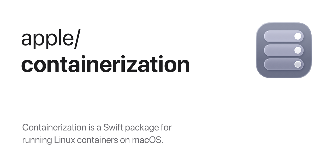
There are plenty of things to improve and iron out - it's far from perfect. I know looks are subjective, but to me this is a welcome refresh - and I think people need to try it and not just judge from the screenshots. There is something here, and I think it will go in the right direction and re-define the design of software UI for years to come.

Member discussion